Info and Help
About Vis-Dashboard
Vis-Dashboard is a component of  Chrome Plugin.
It consists in a tool for exploring and analyzing data in an interactive and visual manner. Currently, two types of visualizations are available:
a timeline and a bar chart.

Frequently Asked Questions
- How are data represented in the Vis-Dashboard?
- How can I change the visualization displayed?
- How can I reorganize items in the timeline or the bar chart?
- What can I do with the timeline visualization?
- What can I do with the bar chart visualization?
- Can I search for new results?
How are data represented in the Vis-Dashboard?
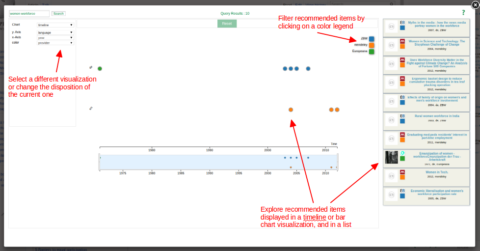
The data displayed in the Vis-Dashboard corresponds to recommended items (documents, pictures, videos, etc)
that are related to a topic of interest (e.g. “women in the workforce”). These items are displayed in the Vis-Dashboard in two different ways:
a) As a list, on the right side
b) As part of an interactive visualization (either a timeline or a bar chart), in the center of the screen
↑
How can I change the visualization displayed?
On the left side of the screen there is a selector for “Chart”, which allows you to switch from timeline to bar chart and viceversa.
↑
How can I reorganize items in the timeline or the bar chart?
The selectors below “Chart” allow you to change the disposition of the items in the visualization. For example, in the timeline,
with the selector for “y-Axis” you can switch from language to provider and the change will be immediately reflected in the visualization.
↑
What can I do with the timeline visualization?
The interactions with the timeline include:
a) You can use the brush (below the timeline) or zoom in/out to change the time range in the x axis
b) Select a node: that will highlight the clicked node and the corresponding item in the recommendation list on the right side.
The opposite action is also valid: clicking on a list item highlights the matching node in the timeline.
c) Filter by color legend: on the right-upper side of the timeline, the color legends classify items by, for example, provider.
By clicking on one of these legends, the items with the corresponding provider are highlighted in the list and in the timeline
↑
What can I do with the bar chart visualization?
The interactions include:
a) Filter by color legend: it works in the same way as in the timeline. Matching items in the recommendation list are highlighted,
and also the bar associated to the color legend clicked is highlighted. The same effect is triggered by clicking on a bar instead of a color legend.
↑
Can I search for new results?
Yes. In the top-left corner of the screen you will find a text box where you can enter a new query.
Press the “Search” button and wait for the new results to be displayed in the Vis-Dashboard.
↑